Design Updates On This Website
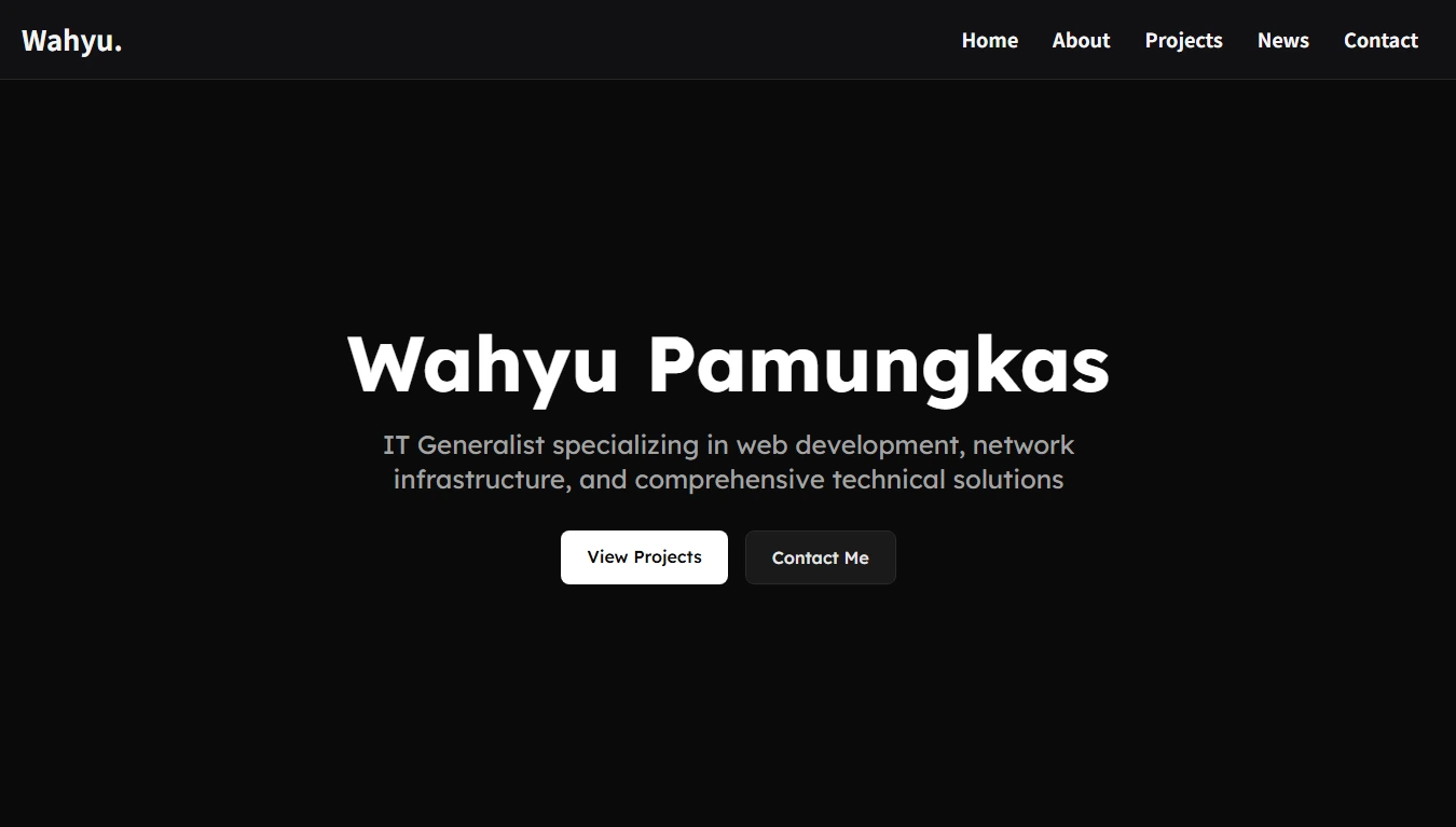
This website has received several design updates to improve both appearance and user experience. One of the most noticeable changes is the switch to dark mode as the main visual style. This change is intended to make the website more comfortable to view, especially during long reading sessions or in low-light environments. The dark color palette also gives the website a cleaner and more modern look while keeping the content easy to read.
In addition to visual changes, the website has been optimized to load faster than before. Various performance improvements were applied, such as reducing unnecessary assets, improving layout efficiency, and optimizing how content is rendered. These changes help the website feel more responsive and smooth, especially when accessed on slower connections or lower-end devices.
The About page has also been redesigned to present information in a clearer and more structured way. The new layout focuses on readability and flow, making it easier for visitors to understand who I am, what I do, and my background. The overall appearance is now simpler, more focused, and consistent with the rest of the website design.
On the Projects page, a category filter has been added to improve navigation. This feature allows visitors to quickly filter and view projects based on specific categories, making it easier to explore relevant work without scrolling through everything. The goal of this update is to improve usability while keeping the interface clean and intuitive.
Another major update is the transformation of the blog system into a news-style article system. The new system is designed to be simpler, more organized, and modern in appearance. Articles are now presented in a cleaner format that focuses on content clarity, making it easier to read updates and announcements without unnecessary complexity.
Lastly, the social media card section on the Contact page has been updated. The new design improves visual consistency and makes social links more noticeable and accessible. This change helps visitors connect with me more easily while keeping the contact page visually balanced and aligned with the overall design direction of the website.
Related articles
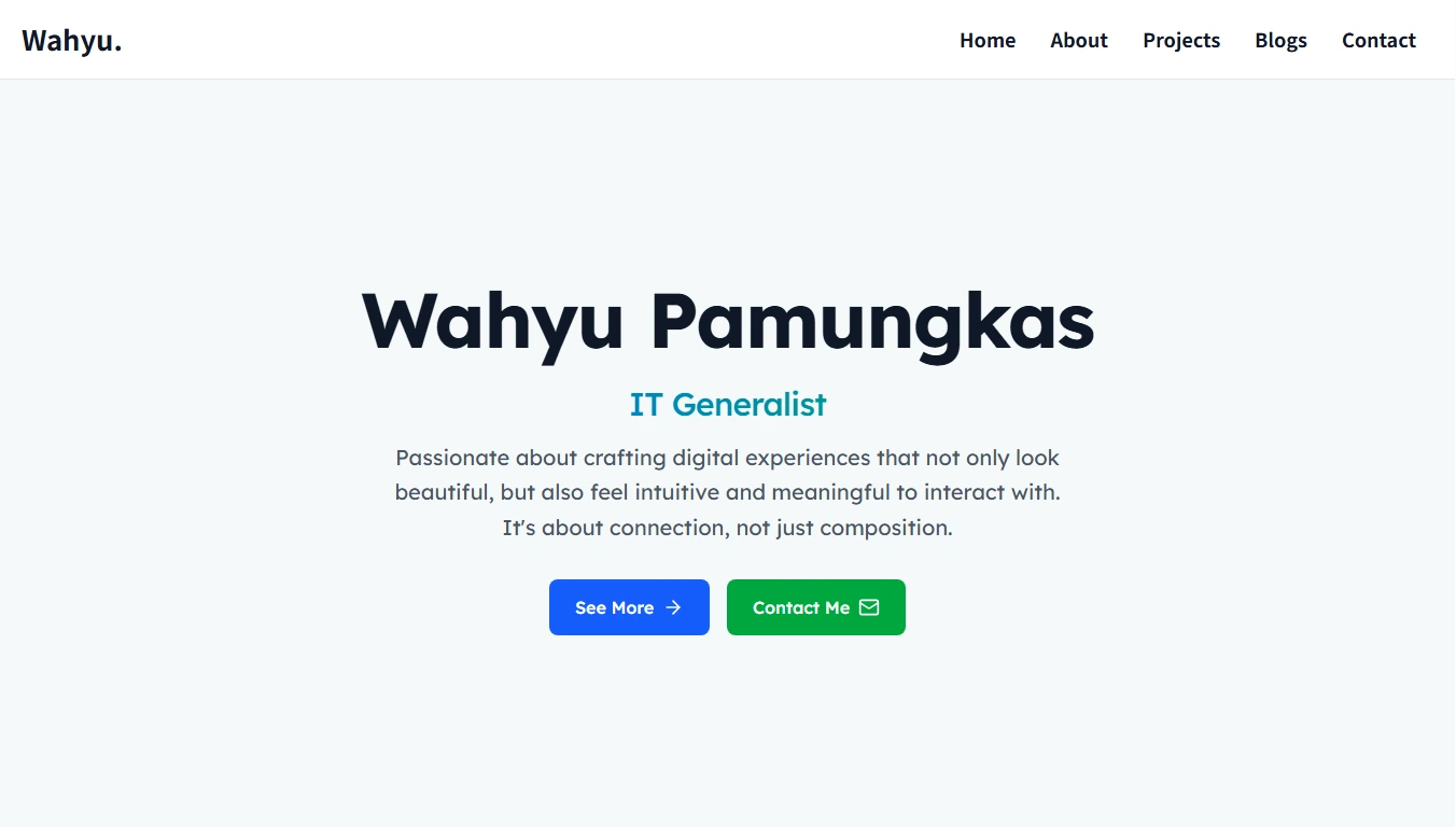
Welcome My Portfolio Website
This portfolio website is created as a personal space to showcase my work, experience, and journey in the field of technology and digital...
Read more